
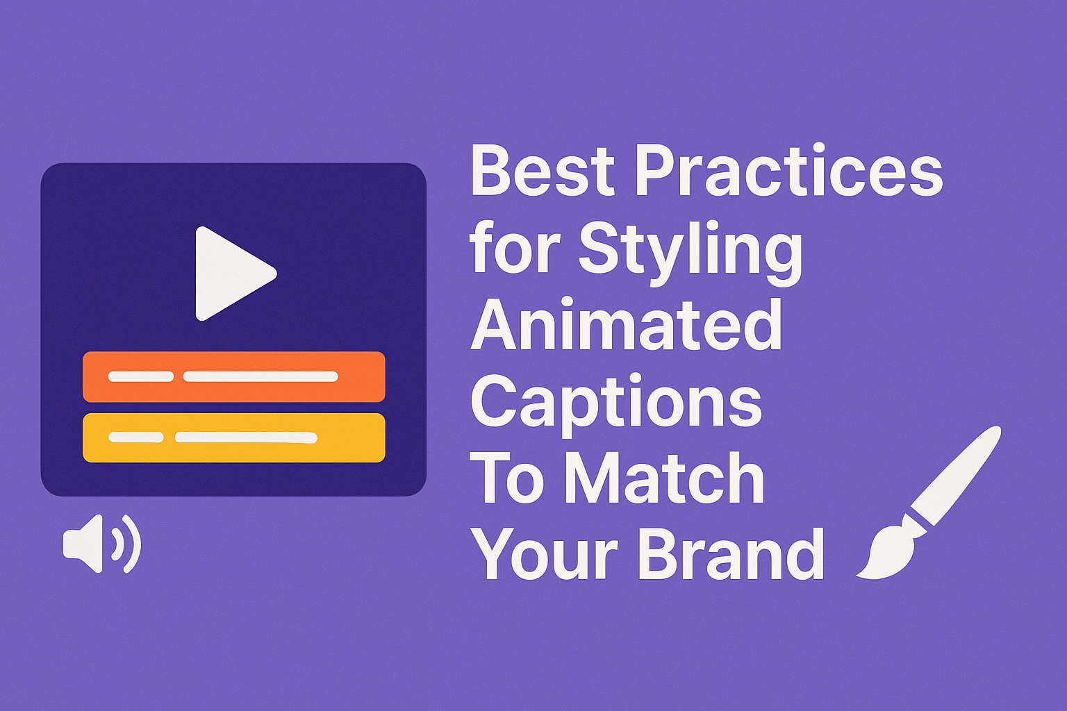
Captions are not just text they are a part of your brand story. Animated captions bring energy, rhythm, and emotion to every video, helping brands connect with audiences visually and emotionally. They enhance accessibility while reinforcing tone, color, and style consistency across digital platforms.
In today’s fast-paced video era, correctly styled captions can transform how your brand feels. Platforms like RenderCut make it effortless to design animated captions that align perfectly with your visual identity, ensuring every frame looks cohesive and memorable.
Why Caption Styling Matters for Branding?
Caption styling matters for branding because it strengthens how people remember your brand and connect with it. When your captions use the same fonts, colors, and layout across all videos, they create a clear visual identity that viewers start recognizing instantly.
This consistency helps build trust and brand recall. Visually appealing captions also improve viewer retention by keeping attention on the screen and making the content easier to follow.
Studies by Meta and HubSpot show that videos with well-styled, branded subtitles increase watch time and engagement rates by over 25%. Consistent caption styling makes every video look polished, accessible, and truly part of your brand’s story
Choosing the Right Font for Your Brand
Choosing the right font for your brand defines how people feel about it. Fonts communicate emotions before words do. A bold, geometric font shows energy and confidence, while a soft script font feels friendly and personal.
Serif fonts, often seen in finance or law firms, create a sense of trust and reliability. In contrast, sans-serif fonts used by tech companies like Google or Spotify reflect modernity and simplicity. Fashion brands prefer elegant, high-contrast fonts that express luxury.
Readability also matters; your chosen font must look clear on mobile, desktop, and in different languages to ensure consistency across every platform and audience.
Picking Brand-Aligned Colors and Backgrounds
Picking Brand-Aligned Colors and Backgrounds means selecting shades that reflect your brand’s identity while keeping visuals clean and engaging. Colors influence perception, for example, blue builds trust, red creates excitement, and green feels natural.
Match your primary brand palette with tones that contrast well against your video background to make text and visuals pop. Maintain visual balance by pairing light text with dark backgrounds or vice versa.
Consistency across platforms like YouTube, TikTok, and Reels builds recognition and trust, making your content instantly identifiable. Every color choice should feel like your brand’s personality brought to life on screen.
Timing and Animation Speed
Picking Brand-Aligned Colors and Backgrounds means matching visuals with your brand’s tone, style, and emotion. Use colors that reflect your brand personality: warm tones for energy, cool shades for calmness, and neutrals for sophistication.
Each caption or motion element should appear at an ideal animation speed of 3–6 seconds per line, allowing viewers enough time to read comfortably. Motion should support the message by enhancing focus, not stealing attention.
Keep transitions smooth and subtle. Align caption pacing with natural speech rhythm, ensuring words appear as they’re spoken. This creates harmony between visuals and voice, making the message feel authentic and easy to follow.
Text Effects and Transitions
Text effects and transitions make your videos look smooth and engaging when used smartly. Fades, slides, and pop-ups help guide the viewer’s eyes and highlight key messages.
A quick fade adds elegance, a slide gives flow, and a pop-up draws attention to important text. RenderCut makes this even easier with its ready-made animation presets, letting creators apply clean motion without complex settings.
Do’s:
• Use transitions subtly for smoother storytelling.
• Keep motion consistent with your brand style.
• Match effect timing with audio or visuals.
Don’ts:
• Avoid using too many animations at once.
• Don’t make text move faster than it can be read.
Maintaining Consistency Across All Videos
Maintaining consistency across all videos builds trust and makes your brand instantly recognizable. Start by creating and saving reusable caption templates so every video follows the same style, tone, and format.
This not only saves time but also ensures your audience experiences the same visual rhythm in every post. Consistent typography, color schemes, and text animations help reinforce your brand identity making your videos feel professional and cohesive.
With RenderCut’s brand preset options, you can lock in your fonts, colors, and effects once and apply them automatically to future projects. This keeps every video aligned with your brand without needing to recreate the style from scratch each time.
Accessibility and Readability
Accessibility and readability ensure that everyone can easily understand and interact with digital content. Clear text size, proper contrast ratios, and smart positioning improve visual clarity and prevent strain.
According to the Web Content Accessibility Guidelines (WCAG), readable content must maintain a minimum contrast ratio of 4.5:1 for normal text and 3:1 for large text, helping users with low vision. Consistent layouts and logical text alignment also play a major role in accessibility.
Multilingual support is equally vital for global audiences, making information inclusive for users across different regions and languages. Together, these elements make content more understandable, engaging, and welcoming for everyone.
Testing and Optimization
Testing and Optimization focus on improving your content performance through data-based experiments. A/B testing different caption styles helps you see what drives more likes, comments, and saves.
By comparing two versions of the same post, you can identify which caption tone or format connects better with your audience. Tracking watch time and viewer retention gives insights into how long people stay engaged with your videos.
These metrics reveal what keeps users watching till the end. Regularly updating your post templates also ensures that your content aligns with evolving brand visuals, keeping your overall presentation fresh and consistent across every post and platform.
How RenderCut Helps You Style Captions Faster?
RenderCut helps you style captions faster by combining AI precision with real-time creativity. It uses AI auto-transcription to instantly convert spoken audio into clean, time-synced text, saving hours of manual typing.
You can then customize captions with the real-time styling preview, which lets you adjust fonts, colors, and animations while seeing live results. The multi-language export feature enables creators to produce captions for global audiences without extra effort.
With custom brand templates, you can maintain consistent caption styles across every video, matching your brand identity perfectly. Start using RenderCut to design captions that speak your brand’s language.
PAA (People Also Ask)
How do I make my video captions match my brand style?
You can align video captions with your brand by using the same fonts, colors, and animation rhythm found in your visual identity. Consistent styling boosts brand recall by over 80% according to Forbes research.
What are the best colors for caption readability?
High-contrast combinations like white text on dark backgrounds or black text on light ones enhance readability by 60%. Yellow or cyan accents are often used for emphasis in branded captions.
How long should animated captions stay on screen?
Animated captions should remain visible for 3–6 seconds per sentence. Studies show that shorter display times improve viewer retention and keep focus on both visuals and words.
Which tools help automate branded subtitles?
Tools like RenderCut, Kapwing, and Descript automatically style captions using brand presets. These tools save up to 70% of editing time by keeping fonts, colors, and motion consistent.
Conclusion
Animated captions are more than a design feature; they are a strategic branding asset that shapes how audiences perceive your content.
By aligning caption motion, typography, and color with your brand identity, you create a cohesive visual experience that strengthens recognition.
Experiment with styles that stay consistent yet creative, ensuring accessibility and readability remain at the core. Your captions can say as much about your brand as your words do.