
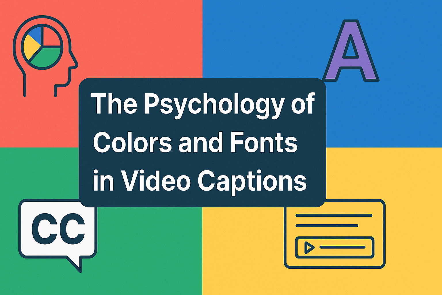
The right colors and fonts in video captions can instantly grab attention and shape how viewers perceive your content. Captions go beyond simply conveying information; they enhance engagement, reinforce branding, and create a memorable visual experience.
Choosing the perfect combination of color and typography can guide emotions, highlight key messages, and make videos more compelling. Tools like RenderCut help creators effortlessly apply psychology-backed colors and fonts, ensuring every caption not only stands out but also strengthens the overall impact of the video.
Why Colors Matter in Video Captions
Using color in video captions is crucial for both emotional impact and practicality. Colors can evoke specific emotions, with red often signaling urgency or passion, blue conveying trust and calmness, and yellow suggesting happiness or optimism. Choosing a color that aligns with your video’s tone can enhance the viewer’s emotional connection to the content.
Beyond emotion, color is vital for readability and attention. Captions must have a high contrast with the video background to be easily read. For example, using a white text with a black outline is a popular and effective choice because it remains legible on both light and dark scenes.
This ensures viewers don’t have to strain their eyes to follow along, keeping them engaged. Studies have shown that videos with well-designed color cues can lead to better viewer retention and learning performance because they reduce cognitive load. Strategic color use in captions is a powerful tool for improving accessibility and overall viewer experience.
The Role of Fonts in Captions
Fonts are more than just text; they play a significant role in conveying a video’s tone and ensuring readability. Serif fonts, with their small decorative lines, often feel traditional or formal, making them suitable for documentaries or news content. In contrast, sans-serif fonts are clean and modern, widely used for their clear legibility on screens.
Playful or handwritten fonts can create a fun, casual vibe for vlogs or social media content, aligning the text’s style with the video’s mood. Beyond aesthetics, readability is paramount for accessibility and comprehension. The best fonts for captions are simple and easy to read quickly, preventing viewer fatigue.
Factors like font size, weight (boldness), and spacing directly impact how a viewer processes the information. A font that is too small or tightly spaced is difficult to read, forcing viewers to strain and potentially disengage. Using a larger, well-spaced font with adequate weight improves comprehension and keeps viewers focused on the content, ensuring your message is delivered effectively.
Combining Colors and Fonts for Maximum Impact
To achieve maximum impact, it’s essential to combine colors and fonts thoughtfully. The pairing of a specific font with a color can significantly affect viewer perception, reinforcing your video’s message and tone. For example, a modern, sans-serif font paired with a bold, vibrant color like red can create a sense of urgency and excitement, perfect for a fast-paced ad.
A traditional serif font with a calming blue can convey a sense of trust and professionalism, ideal for educational or corporate content. Maintaining brand consistency is key. By using the same font and color combination across all your videos, you create a recognizable visual identity that strengthens your brand.
Platforms like RenderCut allow you to save these customized styles as presets, so every video looks cohesive. We see this in successful social media videos all the time. Brands like Netflix use a consistent, high-contrast white font with a black shadow to ensure readability while maintaining a clean, branded look across their trailers and promotional content.
Common Mistakes to Avoid in Captions
When creating captions, a few common mistakes can hurt your video’s effectiveness. First, avoid using too many clashing colors or fonts. Sticking to one or two complementary colors and a single, readable font ensures a clean, professional look that doesn’t overwhelm the viewer.
Using a different color for every other word, for instance, can be visually jarring and make the captions difficult to follow. Another frequent error is low contrast, which makes captions hard to read. If your text color is too similar to the video’s background, viewers will have to strain their eyes, leading to frustration and disengagement.
Always use a high-contrast combination, such as white text with a dark outline or shadow, to ensure readability on any background. Finally, be careful not to overload your captions with excessive animations or effects. While a subtle animation can draw attention to key points, too much movement can become a distraction, pulling the viewer’s focus away from the video’s main content.
How RenderCut Helps Apply Color and Font Psychology

RenderCut simplifies applying color and font psychology to video captions through its user-friendly features. The platform offers a wide selection of customizable fonts, allowing creators to choose a style that matches their video’s tone, whether it’s a modern sans-serif for a tech review or a more casual script for a personal vlog.
RenderCut also provides flexible color palettes and background styles so you can easily create high-contrast, readable captions that also evoke the right emotions. You can pair a calming blue with a clean font for an educational video or use a vibrant yellow with a playful font for an attention-grabbing social media clip.
By allowing creators to save these combinations as presets, RenderCut ensures brand consistency and helps you implement psychology-backed caption styles effortlessly across all your videos.
FAQs
Can the wrong color affect video engagement?
Yes, certain colors can reduce readability or evoke unintended emotions.
Which fonts are best for short-form videos?
Sans-serif fonts with clear spacing tend to perform best for social media captions.
Does RenderCut allow custom brand colors and fonts?
Yes, users can upload brand-specific colors and choose from multiple font options.
Conclusion
Choosing the right colors and fonts in video captions can dramatically impact how viewers perceive and engage with your content. Psychology-backed combinations enhance readability, evoke emotions, and keep audiences hooked. By experimenting thoughtfully with styles, creators can make their videos more memorable and engaging.
Take control of your caption design today and explore tools like RenderCut to effortlessly test different colors, fonts, and layouts. Small design choices can create a big impact, so start applying these insights and watch your engagement grow.