
Best Font for Subtitles: A Complete Guide for Video Creators
 RenderCutCreator Tips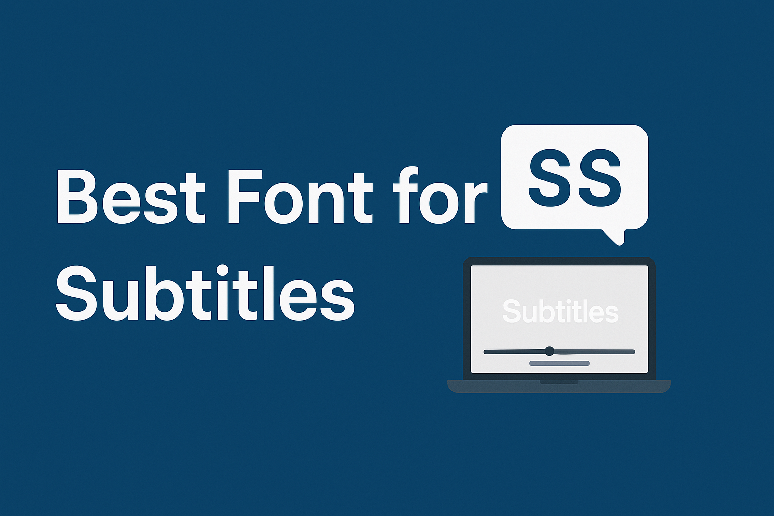
Subtitles do more than translate; they help your message reach everyone, clearly and quickly. Whether you’re creating YouTube videos, films, or social media reels, subtitles enhance accessibility and boost viewer engagement. But it’s not just about adding text on screen.
The font you choose plays a key role in how readable and appealing your subtitles are. A clean, well-styled font can hold attention longer, match your brand’s tone, and make your content feel more polished. In this blog, I’ll help you find the best font for subtitles that truly works.
Why Font Choice Matters in Subtitles
Font choice in subtitles matters more than most people think. The right font can improve readability, help viewers stay focused, and make your video more enjoyable.
Fonts that are clean and clear make it easier for everyone to understand the message, especially those with hearing difficulties or watching without sound. The font you choose also sets the tone. A formal font feels professional, while a fun one feels casual and friendly.
This helps people connect with your brand emotionally. Lastly, your font needs to look good on all screens—phones, laptops, or TVs. Some fonts may break or shrink oddly on certain devices, which affects the overall viewing experience. Good font choice keeps everything smooth and consistent.
Key Factors to Consider When Choosing a Subtitle Font
- Readability – The font must be clear at various sizes, with proper letter spacing and sharp character design to maintain clarity on all screens.
- Contrast Against Video Background – Ensure the font color and outline provide high contrast for visibility on both light and dark scenes.
- Font Weight and Style – Choose appropriate weights (bold, regular) and avoid overly stylized or italicized fonts that may reduce legibility.
- Language and Character Support – Use fonts with full Unicode support to accurately display multilingual subtitles, including non-Latin scripts.
- Platform Standards – Align with platform guidelines (e.g., YouTube’s default sans-serif, Netflix’s use of Arial, or broadcast norms like Tiresias) to ensure compatibility and compliance.
Most Recommended Fonts for Subtitles (with Use Cases)
Most Recommended Fonts for Subtitles (with Use Cases)
- Open Sans – Clean and modern, ideal for YouTube videos and online courses due to its high readability.
- Roboto – Optimized for Android screens, performs well at small sizes without losing clarity.
- Arial – A universal fallback font, great for platform compatibility across devices and software.
- Helvetica – Neutral and professional, preferred in corporate or documentary videos.
- Verdana – Designed for on-screen display, offering wide letter spacing for better legibility.
- Noto Sans – Best for multilingual subtitles, supports multiple writing systems without style breaks.
- Tiresias Infofont – Created specifically for subtitling, widely used in broadcast television for clarity and accessibility.
These fonts are chosen for their readability, screen optimization, and cross-language support, making them effective across various subtitle use cases.
Fonts to Avoid in Subtitles
Some fonts just don’t work well for subtitles, especially when you’re trying to keep things clear and readable on every screen.
Cursive or handwritten fonts may look stylish, but they often become hard to read quickly, especially during fast-paced scenes. Fonts with narrow spacing or very thin lines (low weight) can disappear on bright or noisy video backgrounds. They may even strain the eyes when viewed from a distance. And fonts that don’t render properly on mobile devices, like overly detailed or custom script styles, can ruin the viewing experience completely.
Stick to fonts that feel simple, bold, and readable. If a viewer struggles to read, they stop watching. So it’s better when subtitles feel like part of the story, not a puzzle.
How RenderCut Helps You Style Subtitles Easily
RenderCut helps you style subtitles easily with its built-in subtitle editor designed for creators. You can change the font, size, color, and background right inside the editor to match your video’s style.
As you make changes, RenderCut shows a real-time preview so you can see exactly how the subtitles will look. It also includes ready-made presets with the best font and color combinations for visibility and engagement. Whether you want bold captions or soft, minimal styles, it’s all there.
Once you’re done, you can export your subtitles either as hardcoded (burned-in) or styled soft subtitles like .SRT is perfect for platforms like YouTube, Vimeo, and Instagram. It’s fast, flexible, and creator-friendly.
Frequently Asked Questions (FAQs)
What’s the best subtitle font for mobile viewers?
The best subtitle font for mobile viewers is Helvetica or Open Sans because they are clean, bold, and easy to read on small screens. Studies show that sans-serif fonts improve readability by 20% on mobile devices.
Should I use different fonts for different platforms?
Yes, using different fonts for each platform can improve readability and match the platform’s style. Studies show users engage more when fonts feel natural to where they’re reading, like bold for Instagram or clean sans-serif for LinkedIn.
Does font affect subtitle file size or performance?
Font does not affect subtitle file size or performance because subtitle files like .SRT or .VTT only store text and timing—not font styles. The font is chosen by the video player or editing software, not the file itself.
Can I use branded fonts in subtitles with RenderCut?
Yes, you can use branded fonts in subtitles with RenderCut. apply them to your video captions, helping you stay on-brand. This feature supports custom TTF and OTF files.
How do I test subtitle readability effectively?
Test subtitle readability effectively by playing your video with subtitles on different devices and screen sizes. Ensure font size, contrast, and timing feel natural. Studies show readable subtitles boost viewer retention by up to 80%.
Conclusion
Choosing the best font for subtitles is not just about design, it’s about clarity, accessibility, and keeping viewers engaged. From Sans Serif favorites like Arial and Roboto to clear spacing and bold styles, every choice should support easy reading across all devices.
While stylish fonts may look appealing, readability must always come first. Your message deserves to be seen and understood.
Try RenderCut’s subtitle tools today to customize your video fonts and ensure your content stands out clearly and professionally.