Best Caption Styles That Increase Video Retention and Engagement
The difference between a reel that gets watched for 3 seconds and one that gets watched to the end often comes down to one thing most creators overlook: how the captions look on screen.
Not what they say. How they look.
I have tested over a dozen caption styles across hundreds of short videos. Some styles consistently increased watch time and saves. Others looked “trendy” but killed retention because they were hard to read, visually overwhelming, or completely ignored by the viewer’s eye.
This guide covers the 5 caption styles that actually increase retention and engagement, the styles that fail, how to pick the right one for your content, and the exact process to apply them. If your captions look boring or your engagement is flat, this is where to start.
What this guide covers:
- Why caption style directly impacts retention and engagement
- 5 caption styles that consistently perform (with when to use each)
- 4 caption styles that kill retention
- How to choose the right style based on content type and platform
- Before vs after comparison with real impact
- Step-by-step caption styling process
1. Why Caption Style Matters More Than You Think
Over 80 percent of social media videos are watched without sound. That means for most of your audience, captions are not a supplement to your message. They ARE the message.
But here is what most creators miss: the brain does not just read captions. It processes them visually first. Before a single word registers, the viewer’s eye makes a split-second decision about whether the text on screen is worth reading based on how it looks.
Three things happen in that instant:
- Readability check. Can the brain process the text quickly without effort? Short chunks pass this test. Long paragraph blocks fail it.
- Hierarchy scan. Is there a focal point? Highlighted keywords give the eye somewhere to land. Flat, same-styled text offers nothing to grab onto.
- Pattern recognition. Does the text rhythm feel intentional? Captions that appear and disappear in sync with speech create a pattern the brain wants to follow. Random timing breaks that pattern and causes discomfort.
Caption style controls all three of these. Get it right and viewers read along effortlessly while watching. Get it wrong and they either ignore the text entirely or swipe away because the visual experience feels off.
This is exactly why most captions fail to increase views. They are optimized for transcription accuracy, not for visual processing.
2. Five Caption Styles That Increase Retention
After testing across Instagram Reels, YouTube Shorts, and TikTok, these five styles consistently outperform default auto-captions on every engagement metric.
2.1 Short Chunk Style
What it looks like: 3 to 5 words per caption line. Each chunk appears and disappears in rhythm with the speaker’s delivery.
Why it works: Short chunks match how the brain naturally scans text on small screens. The viewer processes each chunk instantly without stopping to “read” in the traditional sense. This keeps the reading and watching experience running in parallel with zero friction.
Best for: Tutorial content, educational reels, talking head videos, and any content where the message needs to land clearly.
Retention impact: High. This is the foundation style I use on every video. The full system built around chunking produced a 42% watch time increase, documented in How We Increased Reel Watch Time by 42% Using AI Captions.
2.2 Keyword Highlight Style

What it looks like: One word per caption chunk is styled differently from the rest. Usually a contrasting color, bold weight, or background block behind the key word.
Why it works: The highlighted word acts as an anchor point for the eye. The viewer catches the most important information instantly without scanning the whole line. This creates micro-moments of emphasis that improve message recall and increase the chance of saves.
Best for: Any content where specific terms matter: product names, stats, action words, emotional triggers.
Retention impact: Very high when combined with chunking. Highlight alone without chunking is less effective because long lines still cause readability issues.
2.3 Word-by-Word Animation (Karaoke Style)
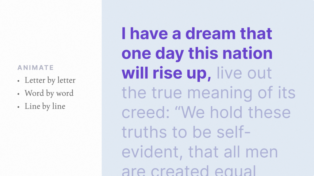
What it looks like: Words illuminate or change color one at a time as the speaker says them. Similar to karaoke lyrics on screen.
Why it works: This style creates a reading rhythm that matches speech cadence exactly. The viewer’s eye follows along word by word, reducing cognitive load because the brain does not need to decide what to read next. Research from 2026 caption performance studies shows word-by-word captions consistently produce the strongest retention across diverse content types.
Best for: Storytelling, motivational content, emotional videos, and content where pacing matters more than information density.
Retention impact: Highest for longer reels (30 to 90 seconds) where viewer fatigue is the main drop-off risk.
2.4 Minimal Clean Style
What it looks like: Simple white or light text on a semi-transparent dark background. No animations, no color changes, no highlights. Just clean, readable text.
Why it works: For visually complex content (cinematic footage, product shots, B-roll heavy videos), minimal captions stay out of the way while still delivering the message. Flashy caption styles can compete with visual content for the viewer’s attention. Minimal style avoids that by being functional without being distracting.
Best for: Cinematic content, brand ads, product videos, and any reel where the visual is the star and the caption is support.
Retention impact: Moderate on its own, but prevents the retention drop that over-styled captions cause on visually rich content.
2.5 Bold Contrast Style
What it looks like: Large, bold text with high contrast against the background. Often white text with a thick dark outline or solid color background block. Text is deliberately oversized compared to standard captions.
Why it works: Maximum visibility in any viewing condition. Bright screens, dim rooms, small phones, large tablets. The text is impossible to miss. This style is especially effective on TikTok and Instagram Reels where the discovery feed is brutally competitive and you need to stop the scroll in the first frame.
Best for: Hook captions in the first 2 seconds, bold statement videos, hot takes, and content designed for maximum immediate impact.
Retention impact: High for short content (under 15 seconds). Can cause visual fatigue on longer videos if used for every caption, so best mixed with other styles.
3. Caption Style Performance Ranking
| Caption Style | Readability | Retention Impact | Best Content Type | Risk of Fatigue |
|---|---|---|---|---|
| Short Chunk | Very high | High | Tutorials, education | Low |
| Keyword Highlight | Very high | Very high | Tips, stats, product content | Low |
| Word-by-Word (Karaoke) | High | Highest | Storytelling, emotional | Medium (long videos) |
| Minimal Clean | High | Moderate | Cinematic, brand content | Very low |
| Bold Contrast | Very high | High (short content) | Hooks, bold takes, TikTok | High (long videos) |
The best approach for most creators is combining styles within a single video. Use bold contrast for the hook caption, short chunk with keyword highlights for the body, and minimal clean for closing lines. This combination maintains attention by varying the visual rhythm throughout the reel.
4. Four Caption Styles That Kill Retention
These are the styles I see on most underperforming reels. Avoiding them is as important as choosing the right style.
| Style to Avoid | Why It Fails | What Happens to Retention |
|---|---|---|
| Full sentence captions (8+ words per line) | Forces the viewer to read instead of watch. Eyes leave the visual content | Retention drops sharply after 3 seconds |
| No highlights or emphasis | Every word looks the same. Brain has no anchor point and treats text as noise | Captions are ignored entirely |
| Over-animated captions | Constant bouncing, spinning, or color changes overwhelm the eye | Visual fatigue causes early exit |
| Poor contrast text | Light text on light backgrounds, thin fonts that disappear against video | Captions become invisible, silent viewers leave |
The over-animation mistake is especially common among creators who discover caption styling tools for the first time. Restraint matters. Simple, clean animations like a subtle fade-in or a gentle pop perform far better than constant motion. Over-styling makes content feel amateur and actually reduces watch time.
5. How to Choose the Right Caption Style
The best caption style depends on three factors: your content type, your platform, and your audience.
By Content Type
| Content Type | Recommended Primary Style | Why |
|---|---|---|
| Tutorials and how-to videos | Short chunk + keyword highlight | Information density needs clear, scannable text |
| Storytelling and personal content | Word-by-word (karaoke) | Rhythm matching builds emotional connection |
| Product demos and reviews | Keyword highlight + minimal | Product names and features need emphasis, visuals need space |
| Bold takes and opinions | Bold contrast + short chunk | Strong statements need maximum visual impact |
| Brand and cinematic content | Minimal clean | Visual quality is the priority, captions support without competing |
By Platform
- TikTok: Bold contrast and keyword highlight styles perform best. Audience expects polished, styled captions as standard. Competing for attention in a fast-scroll feed means your captions need immediate visual impact.
- Instagram Reels: Short chunk with highlights is the strongest combination. The discovery feed is competitive and captions need to hold attention while being easy to scan.
- YouTube Shorts: Word-by-word and minimal styles perform well here. YouTube weights watch time more heavily than other platforms, so styles that reduce fatigue and keep viewers watching longer get rewarded.
6. Before vs After: Same Content, Different Caption Style
Here is what happens when you take the same video and switch from default auto-captions to a styled caption approach.
| Metric | Default Auto-Captions | Styled Captions (Chunk + Highlight) | Change |
|---|---|---|---|
| Average watch time | 5.4 seconds | 8.1 seconds | +50% |
| 3-second retention | 46% | 72% | +57% |
| Saves per 1000 views | 5 | 18 | +260% |
| Shares per 1000 views | 3 | 11 | +267% |
| Completion rate | 21% | 34% | +62% |
The video content did not change. The speaker did not change. The topic did not change. The only variable was how the captions appeared on screen. That is the impact of caption style when applied intentionally.
If your reels get views but the engagement stays flat, caption style is one of the first things to fix. The deeper engagement system is covered in Why Your Reels Get Views but No Engagement (And How to Fix It).
7. Tools for Creating Caption Styles
Not every tool gives you the same level of styling control. Here is how the main options compare for applying the styles in this guide.
| Tool | Word-Level Highlights | Style Templates | Animation Options | Pricing |
|---|---|---|---|---|
| RenderCut | Yes (best-in-class) | Yes | Multiple | Free / $49 lifetime |
| CapCut | Limited | Yes | Many | Free / $7.99 to $19.99/mo |
| Submagic | Yes | Yes | Dynamic templates | $14 to $41/mo |
| VEED | Limited | Yes | Basic | $12 to $24/mo |
The keyword highlight and chunk styles covered in this guide require word-level editing control. Tools that only let you style entire caption lines at once will limit your ability to execute these styles effectively. For a deeper comparison, see Best CapCut Alternatives for Auto Captions and Opus Clip vs Submagic vs RenderCut.
8. Step-by-Step Caption Styling Process
Here is the exact process I follow on every video to apply the styles covered in this guide.
- Generate AI captions. Upload your video and let the tool auto-transcribe. This gives you raw text with timestamps.
- Break into 3 to 5 word chunks. Split every long caption line. This is the most important step. No other styling works if the text blocks are too long.
- Highlight one keyword per chunk. Pick the word that carries the meaning. Apply a contrasting color, bold weight, or background highlight.
- Set the hook caption. Replace the first auto-generated line with a bold, curiosity-driven statement. Use the bold contrast style for maximum impact.
- Choose your body style. Based on your content type (use the tables above), apply the matching style for the rest of the captions.
- Sync timing with speech. Watch the video with captions and adjust so text appears and disappears in rhythm with the speaker.
- Add one pattern interrupt. At the midpoint of the video, change the caption color, position, or size for one line. This re-engages viewers whose attention is starting to drift.
- Export with hardcoded captions. Render the final video so captions display on every platform and device.
This process takes about 5 to 7 minutes per video. For creators handling 20+ videos per week, the batch workflow is in How to Caption 30 Videos a Week Without Burning Out.
Frequently Asked Questions
What caption style works best for reels?
Short chunked captions (3 to 5 words per line) combined with keyword highlights consistently produce the best retention and engagement on reels. This combination is easy to read, creates visual hierarchy, and keeps the viewer scanning along with the video instead of tuning out.
Do caption styles actually affect engagement?
Yes. Caption style directly impacts readability, which affects how long viewers watch. In testing, switching from default auto-captions to styled captions (chunked, highlighted, synced) increased watch time by 50% and saves by 260% on the same content.
Should I use different caption styles for different platforms?
Yes. TikTok audiences respond best to bold, high-contrast styles. Instagram Reels perform well with short chunks and highlights. YouTube Shorts favor word-by-word or minimal styles because YouTube weights watch time heavily and styles that reduce fatigue keep viewers longer.
How do I improve my caption design quickly?
Start with three changes: break text into 3 to 5 word chunks, highlight one keyword per chunk in a contrasting color, and replace the first caption line with a hook statement. These three adjustments take under 5 minutes and produce visible improvements in retention.
Are animated captions better than static captions?
Subtle animations (fade-in, gentle pop, word-by-word reveal) outperform static text. But heavy animations (bouncing, spinning, constant color shifts) cause visual fatigue and reduce watch time. The key is restraint. Simple, clean motion beats flashy effects.
Final Word
Caption style is not a cosmetic choice. It is a retention tool, an engagement driver, and a brand signal all at once.
The five styles that work (short chunk, keyword highlight, word-by-word, minimal clean, bold contrast) each serve a specific purpose. The best creators do not pick one and stick with it forever. They match the style to the content type, the platform, and the moment in the video where attention needs to be held or recaptured.
Start by applying the short chunk plus keyword highlight combination to your next 5 videos. Measure the retention and save rate against your previous videos with default captions. Once you see the difference, experiment with word-by-word for storytelling content and bold contrast for hooks.
If you want a tool that gives you full control over every style covered in this guide, including word-level highlights, saved templates, and animation options, RenderCut is purpose-built for exactly this. Style your captions in minutes, not hours, and keep your branding consistent across every video.
Try RenderCut free and see what styled captions do for your retention.
References
- OpusClip Blog – Research on caption presets and retention performance across content types
- Nielsen Norman Group – Studies on saccadic eye movement and text processing on mobile screens
- Instagram Creators – Official guidance on Reels ranking signals including watch time and completion rate
- Socialinsider – 2026 engagement benchmarks for Instagram Reels and TikTok content