
How to build a caption brand kit for video content
 RenderCutCreator Tips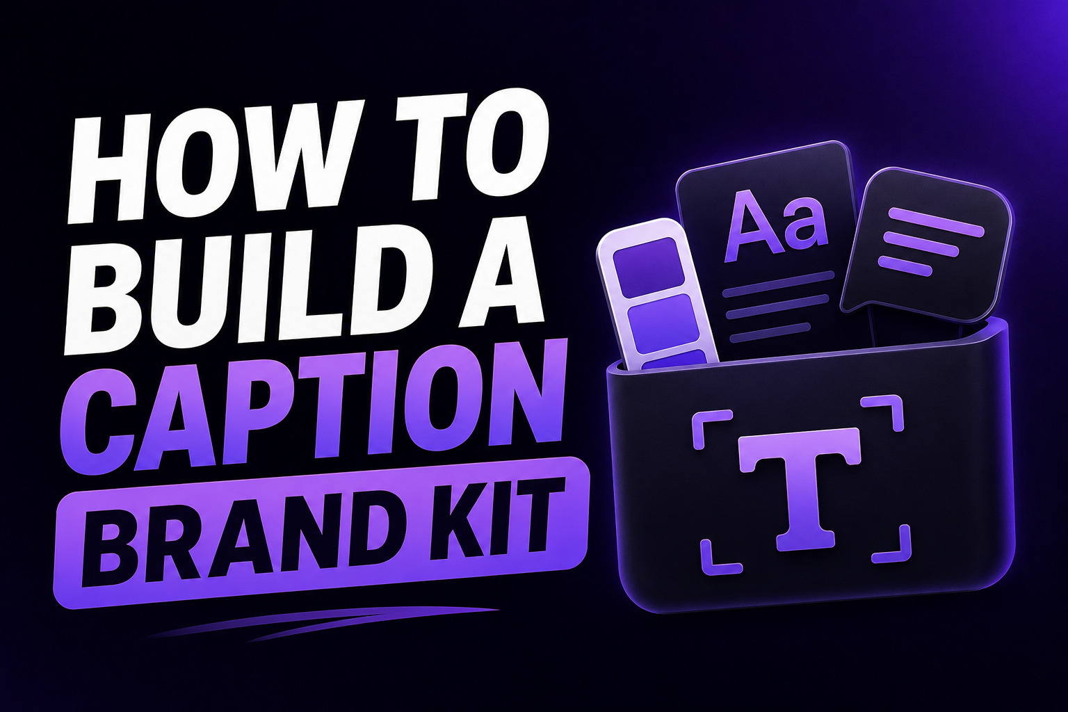
Every brand has a visual identity: logo, colors, fonts, tone of voice. Most brands apply that identity carefully to their website, their graphics, and their social images. Then they add auto-generated captions to their videos in whatever default font the tool picks, and the visual consistency they spent months building disappears in the first frame.
A caption brand kit fixes this. It is a documented set of decisions about how your captions look across every video you produce: the font, the colors, the highlight style, the chunk length, the animation, the placement. Once it is built and saved as a template, every video gets the same professional, recognizable caption treatment automatically.
This guide covers what a caption brand kit contains, why it matters for both brand recognition and algorithmic performance, and the exact steps to build and document one that your whole team can use.
What this guide covers:
- Why caption consistency is a brand and performance decision
- The 7 elements that make up a caption brand kit
- How to choose each element based on your brand identity
- How to document your brand kit for team use
- Platform-specific variations within the same brand kit
- Saving your kit as a reusable template
1. Why Caption Consistency Is Both a Brand and a Performance Decision
Viewers recognize consistent creators before they remember their names. When every video from your account uses the same caption style, the same font, the same highlight color, the same chunk length, viewers begin to associate that visual pattern with your brand. That recognition builds trust, and trust builds audience retention over time.
But caption consistency is not only a brand play. It has a direct performance dimension too.
Caption style affects how long viewers stay on a video. Styled captions with clear visual hierarchy (short chunks, highlighted keywords, readable fonts) consistently produce higher watch time and completion rates than default auto-generated text. When every video uses your optimized brand kit style, every video benefits from those performance improvements.
The opposite is also true. Inconsistent caption styling across a content library signals disorganization to viewers, even when they cannot articulate why something feels off. Caption style should align with your visual identity and audience expectations. The challenge for most teams is consistency. Applying caption styles manually across multiple videos is time-consuming.
The solution is a documented brand kit and a saved template that applies it automatically.
2. The 7 Elements of a Caption Brand Kit
A caption brand kit has seven decisions to make. Once made, they do not need to be revisited until you intentionally refresh your visual identity.
Element 1: Primary Font
Your caption font should be a bold sans-serif that is readable at small sizes on a phone screen. It should either match or complement your existing brand typography.
If your brand uses a custom display font for headlines, do not use it for captions. Custom display fonts are often optimized for large-format use and become hard to read at caption sizes. Instead, choose a readable sans-serif from the same visual family.
Common choices by brand personality:
| Brand Personality | Caption Font |
|---|---|
| Modern, clean, tech | Montserrat Bold or Inter Bold |
| Friendly, approachable | Poppins Bold |
| High energy, bold | Bebas Neue or Anton |
| Corporate, professional | Roboto Bold or Source Sans Pro Bold |
For the full font guide with readability data and sizing recommendations, see Best Fonts for Video Captions on Mobile.
Element 2: Primary Caption Color
The base color for your caption text. White (#FFFFFF) is the default for maximum readability on most video backgrounds. If your brand uses a dark palette or you post frequently on light backgrounds, consider a dark text with a light background instead.
Lock in one primary color and do not vary it between videos unless a specific content type requires it.
Element 3: Highlight Color
The color used to emphasize the key word in each caption chunk. This is where your brand color most naturally appears in captions.
If your brand color is bright enough to read on video (high contrast against the video and against white text), use it directly as your highlight color. If your brand color is pastel, dark, or low-contrast, use a modified version that maintains readability.
| Brand Color Type | Highlight Approach |
|---|---|
| Bright primary color (red, blue, yellow, green) | Use directly as highlight color |
| Pastel or light color | Darken by 20 to 30% for contrast |
| Dark color (navy, forest green, burgundy) | Use a light variant or accent color |
| Neutral (grey, beige, brown) | Choose an accent color from your palette |
Element 4: Background Treatment
How you handle the contrast between caption text and the video background:
- Semi-transparent dark bar behind the text: works on any video background, preferred for professional content
- Text outline or shadow: 2 to 4px dark outline around bold text, works on most backgrounds
- Solid color background block: brand color or dark block per word or per line, strong visual impact
- No background: only works reliably when filming against consistently dark backgrounds
Pick one and apply it consistently. Mixing background treatments between videos makes the content look unplanned.
Element 5: Chunk Length and Line Format
Decide on your standard chunk length and stick to it across every video:
- 3 to 5 words per line: standard for short-form social video, maximizes mobile readability
- 5 to 7 words per line: works for longer-form or educational content where more context per caption is useful
- 1 to 2 lines maximum: never exceed two lines on screen at once
Your chunk length should match your content pace. Fast, punchy talking head content reads better at 3 words per line. Slower, explanatory content can carry 5 to 7 words.
Element 6: Animation Style
The way captions appear and disappear on screen:
- Fade in/out: clean and professional, works across all content types
- Pop on: instant appearance with slight scale bounce, energetic, popular on short-form
- Word-by-word (karaoke): each word illuminates in sequence with speech, highest retention driver but requires more production control
- Slide in: text slides from the side or bottom, more dynamic but can feel dated if overused
- Static: no animation, text simply appears and disappears, most appropriate for professional/B2B contexts
Match the animation to your brand energy. A fitness motivation brand suits pop-on or word-by-word. A financial advisory brand suits fade or static.
Element 7: Placement and Safe Zone
The default position of your captions on screen. Center-bottom, roughly 60 to 80% down the frame, clears most platform UI elements across Instagram, TikTok, YouTube Shorts, and Facebook Reels simultaneously.
If you post primarily to one platform, tune placement to that platform's safe zone specifically. If you cross-post, use the universal cross-platform safe zone: 900x1400px centered on a 1080x1920 frame.
3. Documenting Your Caption Brand Kit
Building the kit is not enough. It needs to be documented so every team member, editor, or freelancer who touches your video content applies the same decisions.
What your caption brand kit document should include:
- Font name, weight, and exact download source (Google Fonts, Adobe Fonts, or custom file)
- Primary text color as a hex code (#FFFFFF, not "white")
- Highlight color as a hex code
- Background treatment type and opacity percentage if applicable
- Standard chunk length in words per line
- Maximum lines per frame
- Animation style name
- Default placement as a percentage of frame height from top
- Platform-specific variations (if any)
- Example screenshot of a correctly styled caption from one of your videos
The last item is the most important. A written spec can be interpreted differently by different people. An example screenshot eliminates ambiguity. Show what "correct" looks like, not just what the rules say.
Create a one-page quick reference card that summarizes your most critical brand video guidelines: logo placement, approved fonts, color hex codes, and caption requirements. This single document eliminates the most common source of caption inconsistency across a content team.
4. Platform-Specific Variations Within One Brand Kit
Your core brand kit applies everywhere. Some platforms benefit from minor variations while keeping the brand identity intact.
| Platform | Suggested Variation from Core Kit |
|---|---|
| Instagram Reels | Full brand kit as documented. Hook caption in bold contrast style. |
| TikTok | Same as Reels. Consider slightly larger font size for the more visually competitive feed. |
| YouTube Shorts | Reduce animation intensity if content is longer (40+ seconds). Word-by-word works well. |
| Reduce animation to fade or static. Slightly smaller highlight color presence for professional tone. | |
| Facebook Reels | Same as Reels core kit. Consider slightly larger text for older demographic. |
The goal is subtle adaptation, not a different brand identity per platform. The font, the colors, and the core visual pattern should be recognizable across all platforms even with minor sizing or animation adjustments.
5. Saving Your Brand Kit as a Reusable Template
Once your seven brand kit decisions are made and documented, the next step is saving them as a template in your captioning tool so they apply automatically to every new video.
What a saved template stores:
- Font family and weight
- Text color and highlight color
- Background treatment settings
- Default chunk length preference
- Animation style
- Default placement position
With a saved template, applying your complete brand kit to a new video takes one click. For creators producing 20 to 30 videos per week, this eliminates the styling decision overhead that adds hours of wasted time across a content operation. The full batch workflow that uses templates at scale is in How to Caption 30 Videos a Week Without Burning Out.
For agencies managing multiple client accounts, each client gets their own saved template. One click switches between brand kits, maintaining consistency across every client account without any re-styling. The multi-client system is covered in Content Repurposing System for Agencies Managing Multiple Clients.
6. Before and After: What Brand Kit Consistency Produces
| Without a Caption Brand Kit | With a Caption Brand Kit |
|---|---|
| Different font on every video | Same recognizable font across all content |
| Highlight colors vary or missing | Brand color appears consistently as keyword emphasis |
| Chunk length varies with whoever edited the video | Every video reads at the same pace |
| Animation style changes based on template mood | Consistent visual rhythm across all content |
| Captions feel like an afterthought | Captions feel like a deliberate brand element |
| Viewers do not associate caption style with the brand | Caption style becomes part of brand recognition |
The shift from the left column to the right does not require more time per video. It requires one session of 30 to 45 minutes to build the kit, document it, and save the template. Every video after that benefits automatically.
Frequently Asked Questions
What is a caption brand kit?
A caption brand kit is a documented set of styling decisions that define how captions look across all your video content: font, primary color, highlight color, background treatment, chunk length, animation style, and placement. It is saved as a template in your captioning tool so every new video automatically matches your brand identity.
How long does it take to build a caption brand kit?
The initial build takes 30 to 45 minutes: choosing each element, testing on a sample video, documenting the decisions, and saving the template. Every video produced after that applies the kit in one click with no additional time investment.
Can agencies use one caption brand kit for multiple clients?
No, and they should not. Each client needs their own caption brand kit that matches their specific visual identity. The advantage for agencies is that each client's kit is saved as a separate template. Switching between clients takes one click, with no re-styling required. The multi-client template system is designed exactly for this workflow.
Do caption styles affect algorithm performance?
Yes. Styled captions with clear visual hierarchy (optimized chunking, keyword highlights, readable fonts) produce measurably higher watch time and completion rates than default auto-generated text. Consistency across your content library also builds viewer recognition, which improves return visits and follow rates over time.
Should I use the same caption brand kit on every platform?
Use the same core kit everywhere, with minor platform-specific adjustments. Animation intensity can be reduced for LinkedIn's professional context. Font size can be slightly increased for TikTok's visually competitive feed. The font, colors, and core visual pattern should remain consistent and recognizable across all platforms.
Final Word
A caption brand kit is the bridge between captions that exist and captions that perform. Without it, every video is a fresh styling decision, quality varies based on who edited it, and the visual consistency that builds brand recognition never accumulates.
With it, every video gets the same professional caption treatment in one click. The font is right. The highlight color is on brand. The chunk length is optimized. The animation matches your content energy. The placement clears every platform's safe zone.
Build the kit once. Document it. Save it as a template. Then never think about caption styling decisions again.
RenderCut lets you save a complete caption brand kit as a reusable template, including font, colors, word-level highlight style, animation, and placement. One click applies your full brand kit to every new video. Try RenderCut free and build your caption brand kit today.
References
- Poko Video - Best caption styles for marketing videos 2026: word-by-word highlights, brand consistency, and caption style selection guide
- Puritano - Video style guide for brand consistency 2026: caption requirements, governance, and one-page quick reference card approach
- 3Play Media - Closed caption styling and formatting best practices: font, color, contrast, and style guide documentation
- PostNitro - Brand style guide template 2026: documenting visual decisions for team use and operational consistency