Why Auto Captions Look Bad (And How to Make Them Look Professional)
You spent 30 minutes filming a reel. The lighting was good. The audio was clean. The message was solid. Then you added auto captions and the whole video suddenly looked like it was made in 2019.
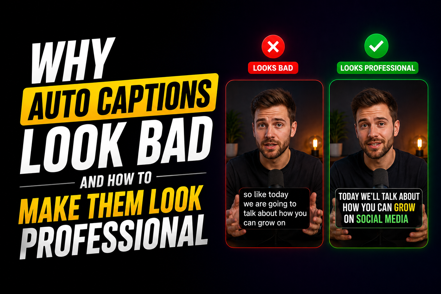
Default auto captions have a specific look. Small white text. Full sentence blocks. No highlights. No visual rhythm. The kind of subtitles that scream “I did not spend any time on this” to every viewer who scrolls past. And viewers notice. They may not be able to explain what looks off, but the perception registers instantly: this creator does not care about details.
I used auto captions on every video for months before I realized they were actively hurting my content. The moment I switched to styled captions with chunked text, highlighted keywords, and intentional design, everything changed. Watch time went up. Saves went up. Comments mentioned the visual quality specifically. The content was the same. The captions were the difference.
This guide explains exactly why auto captions look bad, the psychology behind readable text on screen, and the step-by-step process to make your captions look professional without spending hours on styling.
What this guide covers:
- 7 specific reasons auto captions look unprofessional
- The psychology of how viewers process on-screen text
- Elements that separate amateur captions from professional ones
- Caption styles that look premium in 2026
- Before vs after comparison
- Step-by-step professional caption workflow
- Common styling mistakes to avoid
1. Seven Reasons Auto Captions Look Bad
Auto caption generators are built for one purpose: transcription accuracy. They are not built for visual design, readability, or retention. That single design choice creates every problem on this list.
| Problem | Why It Happens | How It Looks on Screen |
|---|---|---|
| Full sentence blocks | AI transcribes complete thoughts as single lines | 8 to 15 words crammed on screen at once |
| Default font (usually Arial or system sans-serif) | Tools use the safest, most generic font available | Instantly recognizable as auto-generated |
| No keyword emphasis | Every word gets the same styling treatment | Flat, uniform text with no visual anchor |
| Poor timing sync | Captions align to audio timestamps, not speech rhythm | Text appears slightly before or after the spoken words |
| Small text size | Default sizing prioritizes not blocking the video | Captions that require squinting on a phone screen |
| No background contrast | Text renders directly over video without protection | Words disappear against light backgrounds |
| Static appearance throughout | No style changes, no pattern interrupts, no visual variation | Same look from first second to last. Eye stops noticing. |
Any one of these problems makes captions look amateur. Most auto-generated captions have all seven at once. That is why the gap between default captions and styled captions is so visible, even to viewers who know nothing about video editing.
2. The Psychology of Readable Captions
The brain does not read captions the way it reads a book. On a phone screen, while video plays in the background, the eye operates in scan mode: rapid jumps between points of visual interest, processing clusters of words in fractions of a second.
Three things the brain needs from on-screen text:
- Minimal cognitive load. Short text chunks (3 to 5 words) are processed automatically. Long blocks (8+ words) force the brain to switch from scanning to reading. That switch costs attention and competes with the visual content.
- A focal point. The eye needs somewhere to land first. A highlighted keyword, a contrasting color, a larger word. Without a focal point, the eye wanders across the text and the brain categorizes the caption as noise.
- Predictable rhythm. When captions appear and disappear in a steady pace that matches speech, the brain locks into a pattern. That pattern feels comfortable and keeps the viewer engaged. When timing is random or mismatched, the brain detects the inconsistency and the viewer feels something is “off” even if they cannot identify what.
Auto captions fail all three tests. They present long blocks (high cognitive load), style every word identically (no focal point), and sync to audio timestamps rather than speech rhythm (broken pattern). The result is captions that are technically accurate but visually invisible.
This is exactly why most captions fail to increase views: they were designed for transcription, not for how the human brain actually processes text on a screen.
3. Elements That Make Captions Look Professional
Professional captions are not about fancy effects. They are about intentional design choices that improve readability and signal quality. Here are the seven elements that separate amateur from professional.
- Short text chunks (3 to 5 words per line). This is the foundation. Everything else builds on it. If your captions are still showing full sentences, no amount of styling will fix the amateur look.
- Keyword highlights. One word per chunk styled differently: contrasting color, bold weight, or background block. This creates the focal point the eye needs.
- Premium font choice. Sans-serif fonts like Montserrat, Poppins, or Inter read better on small screens than the default system fonts. Recommended line length: 32 to 42 characters maximum.
- Adequate text size. Captions should be large enough to read comfortably on a phone without squinting. Test on your own phone before publishing. If you have to lean in, the text is too small.
- Background contrast. A semi-transparent dark bar behind light text, or a text outline/shadow that ensures readability against any background. Never rely on the video itself to provide contrast.
- Synced timing. Captions appear when the speaker says the word, not before or after. Pauses match pauses. Energy matches energy. The captions feel like part of the video, not something layered on top.
- Consistent branding. Same font, same colors, same highlight style across every video. This consistency is what makes a creator’s captions recognizable and gives the channel a polished, professional identity.
4. Caption Styles That Look Premium in 2026
| Style | What It Looks Like | Best For | Professional Level |
|---|---|---|---|
| Chunked + Highlighted | 3 to 5 words per line, one keyword in contrasting color | Tutorials, tips, educational content | High |
| Word-by-Word (Karaoke) | Words light up one at a time matching speech | Storytelling, emotional content, motivational | Very high |
| Minimal Clean | White text, dark semi-transparent background, no effects | Cinematic, brand content, ads | High |
| Bold Contrast | Large, thick text with strong outline or solid background | Hook captions, bold takes, TikTok | High (short use) |
| Auto-generated default | Small Arial, full sentences, no highlights | Nothing. It hurts every content type. | Amateur |
The bottom row is what you are replacing. The top four are what professional creators use in 2026. The full ranking with performance data per style is in Best Caption Styles That Increase Video Retention and Engagement.
5. Before vs After: Default Captions vs Professional Captions
| Element | Auto-Generated Default | Professional Styled |
|---|---|---|
| First line on screen | “So basically what happened was we tried this new approach” | “This approach changed everything” |
| Words per line | 10 to 15 | 3 to 5 |
| Font | Default Arial, small size | Montserrat Bold, readable size |
| Keyword emphasis | None | One keyword highlighted per chunk |
| Background | None (text floats over video) | Semi-transparent dark bar or text shadow |
| Timing | Auto-synced to audio timestamps | Manually tuned to match speech rhythm |
| Viewer perception | “This looks auto-generated” | “This creator knows what they are doing” |
| Impact on retention | Minimal or negative | 42% watch time increase in testing |
That last row is not theoretical. The 42% increase in watch time came from switching from default captions to the styled system documented in How We Increased Reel Watch Time by 42% Using AI Captions. Same content. Same creator. Only the captions changed.
6. Tools for Professional Caption Design
| Tool | Word-Level Styling | Saved Templates | Font Options | Pricing |
|---|---|---|---|---|
| RenderCut | Yes (best-in-class) | Yes | Multiple premium fonts | Free / $49 lifetime |
| CapCut | Limited | Yes | Many | Free / $7.99 to $19.99/mo |
| Submagic | Yes | Yes | Dynamic templates | $14 to $41/mo |
| VEED | Limited | Yes | Basic | $12 to $24/mo |
The key differentiator is word-level styling. Tools that only let you change the font or color of an entire caption line cannot produce the highlighted keyword effect that separates professional captions from default ones. For a full comparison, see Best CapCut Alternatives for Auto Captions.
7. Step-by-Step Professional Caption Workflow
- Generate AI captions. Upload your video and let the tool transcribe. This gives you the raw text. Do not publish it as-is. This is the starting point, not the finished product.
- Break into 3 to 5 word chunks. Split every long caption line. If a line has more than 5 words, it needs to be split. No exceptions.
- Highlight one keyword per chunk. Find the word that carries the meaning. Apply a contrasting color, bold weight, or background highlight. This takes about 2 seconds per chunk once you get the rhythm.
- Set the hook caption. Replace the auto-generated first line with a scroll-stopping hook. Bold contrast style, large font, maximum visibility. The first caption is the most important one. See Why Viewers Scroll Away in the First 3 Seconds for the hook framework.
- Choose a premium font. Switch from the default system font to something cleaner: Montserrat, Poppins, Inter, or Bebas Neue. Sans-serif fonts read best on small screens.
- Add background contrast. Apply a semi-transparent dark bar behind the text or a text shadow/outline. Test against the lightest frame in your video to make sure nothing disappears.
- Sync timing to speech. Watch the video and adjust caption appearance to match the speaker’s rhythm. Captions that land with the spoken word feel intentional. Captions that arrive early or late feel automated.
- Save as a template. Once you have the font, color, highlight style, background, and placement dialed in, save it. Apply the same template to every future video. This eliminates repeat decisions and keeps your brand consistent.
- Export with hardcoded captions. Render the video with captions baked in so they display correctly on every platform and device.
This process takes about 5 to 7 minutes per video. For high-volume creators, the batch workflow covers 30 videos in under 2 hours. That full system is in How to Edit 30 Videos a Week Without Burning Out.
8. Common Styling Mistakes to Avoid
| Mistake | Why It Hurts | Fix |
|---|---|---|
| Too much text on screen | Creates visual clutter, viewer stops reading | 3 to 5 words max per line |
| Weak contrast | Text disappears against light or busy backgrounds | Always use background bar, shadow, or outline |
| Over-animation | Constant bouncing, spinning, or color shifts cause fatigue | Subtle fade or pop only. Restraint wins. |
| Poor placement (covered by UI) | Platform buttons overlap the caption area | Keep captions in the center safe zone. Test on phone before publishing. |
| Inconsistent styling across videos | Brand looks unprofessional and unrecognizable | Save one template and apply to every video |
| Decorative fonts | Script and serif fonts are hard to read at small sizes on screen | Sans-serif only. Readability over aesthetics. |
The over-animation mistake deserves extra attention. Creators who discover caption styling tools for the first time often go overboard with effects: every word bounces, colors shift constantly, text flies in from six directions. This looks worse than default captions, not better. Professional captions are clean, readable, and intentional. The goal is clarity, not spectacle.
Frequently Asked Questions
Why do auto captions look bad?
Auto captions look bad because they are built for transcription accuracy, not visual design. They show full sentences in default fonts with no keyword emphasis, no background contrast, and timing synced to audio timestamps rather than speech rhythm. These design choices make captions look generic and auto-generated.
How do I make captions look professional?
Break text into 3 to 5 word chunks, highlight one keyword per chunk with a contrasting color, use a premium sans-serif font, add a background bar or text shadow for contrast, and sync timing to match speech rhythm. Save these settings as a template and apply to every video for consistent branding.
Do caption styles affect video retention?
Yes. Styled captions with short chunks, highlighted keywords, and synced timing increase watch time by making content easier to follow for the 80%+ of viewers watching without sound. In testing, the switch from default to styled captions produced a 42% increase in watch time on the same content.
What font is best for video captions?
Sans-serif fonts like Montserrat, Poppins, Inter, and Bebas Neue are the best choices for video captions. They remain readable at small sizes on phone screens. Avoid decorative, script, or serif fonts because they sacrifice clarity at the sizes captions require.
Can I fix auto captions without starting over?
Yes. Most captioning tools let you edit the auto-generated text after transcription. You do not need to retype everything. Just split long lines into chunks, add highlights, change the font, apply a background, and adjust timing. The AI transcription is the starting point. The styling is what makes it professional.
Final Word
Auto captions are not a finished product. They are a first draft.
The difference between captions that look cheap and captions that look professional comes down to seven styling decisions: chunk length, keyword highlights, font choice, text size, background contrast, timing sync, and brand consistency. None of these are complex. None require design expertise. They require intentionality.
5 to 7 minutes of caption styling per video. That is the gap between “this looks auto-generated” and “this creator knows what they are doing.” The viewers notice. The algorithm notices. The engagement data proves it.
If you want a tool that gives you word-level highlights, premium fonts, saved templates, and one-click style application, RenderCut is built specifically for turning auto captions into professional captions. No subscription. No hours of manual work. Just clean, styled captions that make your content look the way it deserves to look.
Try RenderCut free and make your captions look professional today.
References
- Opus Clip Blog – TikTok caption and subtitle best practices including font, contrast, and placement
- Pixflow – AI automatic captions analysis across Premiere Pro, CapCut, and DaVinci Resolve (2026)
- Nielsen Norman Group – Research on saccadic eye movement and text scanning behavior on mobile screens
- Automateed – 2026 subtitle styling trends and animated caption best practices